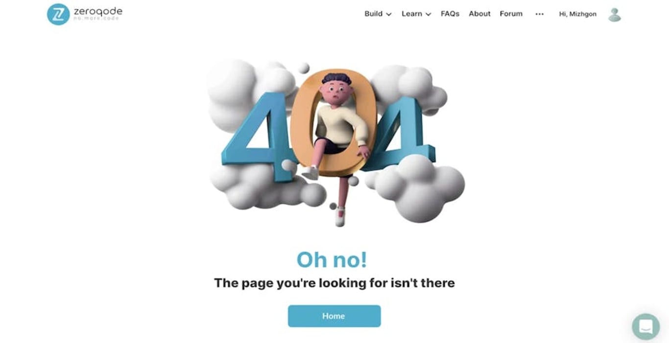
Reduce Website Bounce Rates Using 404 Error Page.
Users don't like 404 page but there are fun ways that we can communicate with visitors and create brand loyalty.

Error 404 page appears when you try to follow a dead link that obviously can’t be found. There are several possible reasons for that:
- URL was changed
- The page was deleted
- The link spelling is wrong
Remember your feelings when clicking on such link: the full range of emotions comes across your face. Disappointment, anger, frustration — that’s what you feel when coming across these dry 404 numbers. Still, such page can become your sheet anchor to keep visitors on your website longer.
Why do you need an error 404 page?
Error 404 page is one of the tools that can make a customer loyal to your product.
First of all, the friendly design of the page is a token of the user’s good mood. If a customer is happy then the chance he’ll stick around your website is really high.
Second, a creative and user-friendly error page leads to top marks in organic search. Complete your broken link messages with an eye-catching design — it is great for SEO.
Third and final point: 404 error page is another opportunity for a dialog with the potential client. Talk to your audience and they won’t go away.
How to improve the 404 error page?
Stick to your site design
The error page style is part of your brand. It shouldn’t differ. GitHub hosting service is a perfect example of sticking to ideals. If you turn to geeks, do it by means of Star Wars allusion. What a creative 404 error page!
Be friendly and polite
Remember that our world is not consisting only of programmers, that’s why the best 404 pages are always simple and understandable. It is always better to say “oops, something went wrong” than to use robot-like depersonalized “page not found”.
Entertain!
Just add some humor in relation to what you present on your site. Originality is the best way to catch customer’s attention and give great results. Bakken & Baæk digital studio took this method on board and got their money’s worth by creating some funny 404 pages!
Their error page looks fresh and distinctive. Besides, it interacts with the customer, being both useful and fun. Here’s another example of the “humor+simplicity” formula from LEGO 404 page design:
Be useful!
Though there shouldn’t be too much information on the error 404 pages, you have to add some elements to make it helpful.
Here’s what you can add:
- The link to the main page
- The broken link button
- Search form
Here are 404-page examples that prove us right.
Simplicity and helpfulness — that’s what Bubble error page represents. Mind the main page button at the bottom of the page.
Take a look at what Airbnb offers its customers. By the way, this error page also features amazing animation that reminds us how wrong it is to be piggy-wiggy in a rented apartment:
Prevent an error
Check the broken links on your website constantly. Do it once a month — and it will minimize the number of 404 error page views.
Mind that Google has great webmaster services for finding dead links on your site.
Now you know that the 404 error page is totally fun to create! Your personal involvement can make it the best way to communicate with visitors and make them loyal.
Want to make your own app with a creative 404 error page?
Send us a request and we will give you the cost and deadline estimate.